dooo.ing.
The studio's own name and identity, designed first and handed over the same way a client's would be.
- Business
- dooo.ing, a digital media studio in Guindy, Chennai
- For
- Clients choosing a studio, and the team using the brand every day
- Making
- Name, logo, colour, type, voice, motion and this website
- Year
- 2026
- Naming
- Logo system
- Colour and type
- Voice
- Motion
- Website
The brief
A studio that designs brands has to hold its own brand to the same standard. The name had to be easy to say, the logo had to read from a shopfront down to a favicon, and both had to say what the studio does without a line of explanation.
The idea
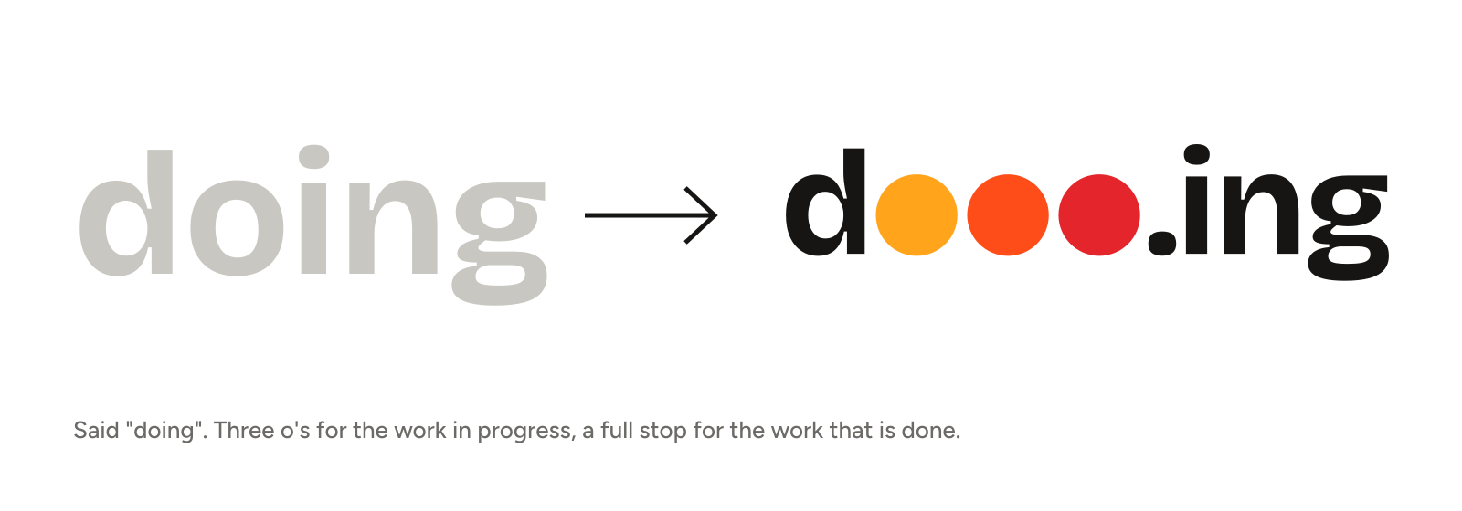
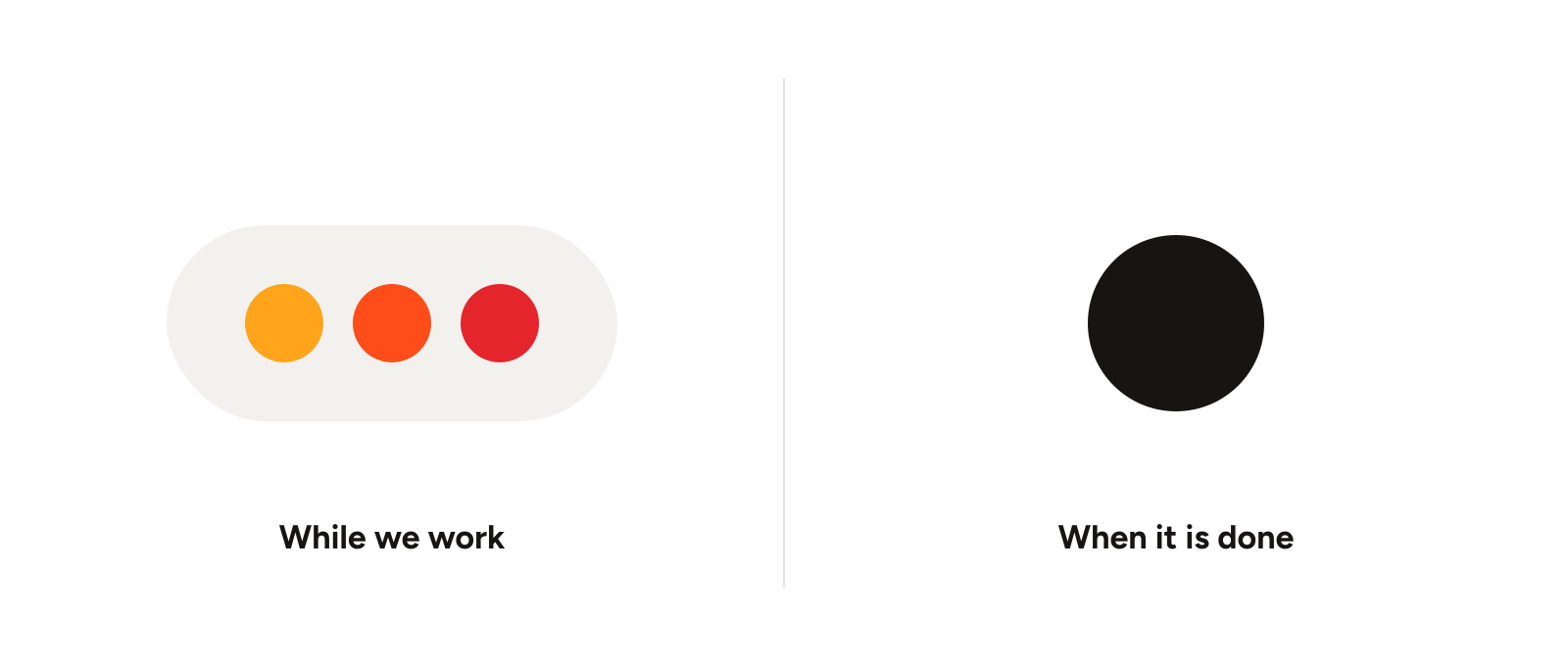
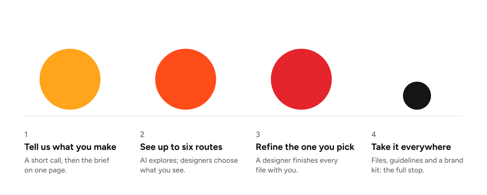
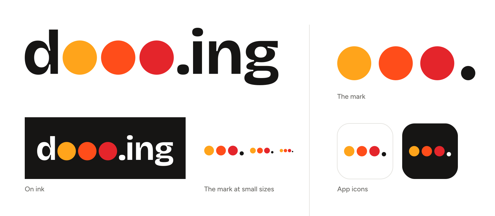
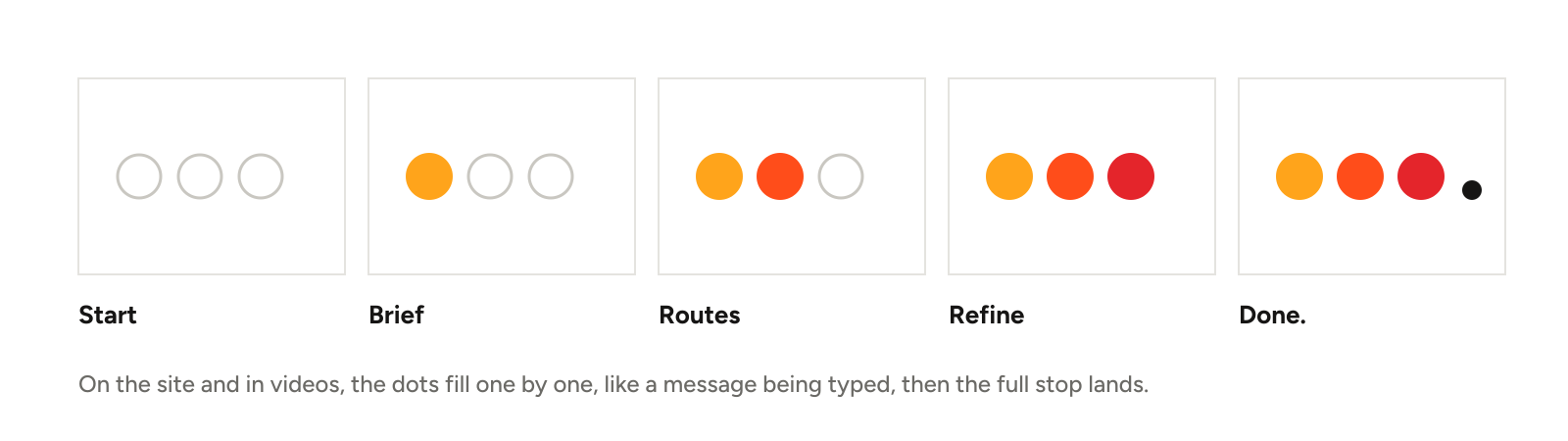
The name is said “doing”. Its three o’s are the dots you see while someone is typing a reply: work in progress. The full stop after them is the moment the work is done. Every project we run moves from those three dots to that full stop.
What we made
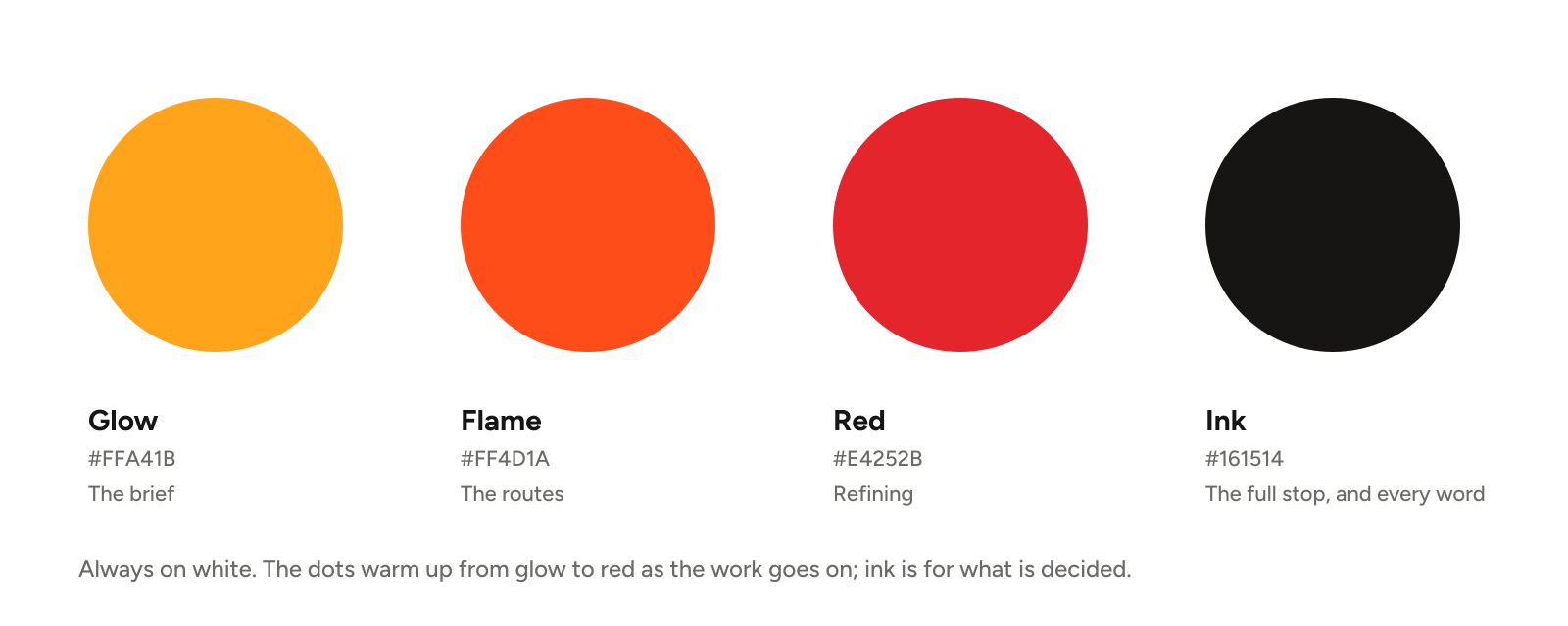
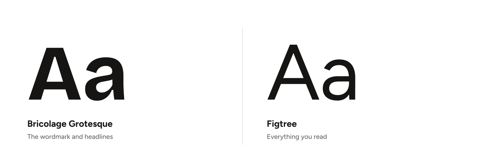
We explored names, colours and sizes with AI, then a designer chose and refined them. The wordmark is set in Bricolage Grotesque Bold, with its three o’s redrawn as solid dots in glow, flame and red that warm up as the work goes on. The full stop and every word stay in ink, on white. When the dots appear without the letters, the full stop always comes with them, so the mark keeps its meaning at any size.
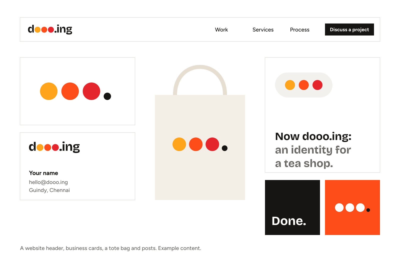
What was handed over.
- The wordmark, the reversed wordmark and the mark (three dots and a full stop), as SVG
- A favicon and app icons at 32, 180, 192 and 512 px, and a link-preview image
- Four colours, each with its screen value and one job
- Bricolage Grotesque and Figtree, with a role for each
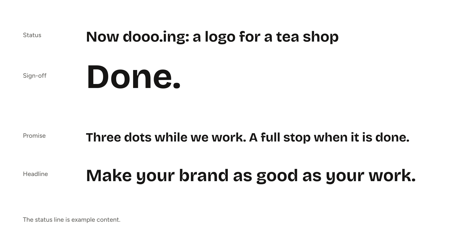
- A status line for work in progress and a sign-off for work that is done
- This website, built on the same system